Marketer in Milwaukee. I plan and run campaigns, events and partnerships, and I do a lot of the writing and design along the way.
Fluent in English and Spanish.
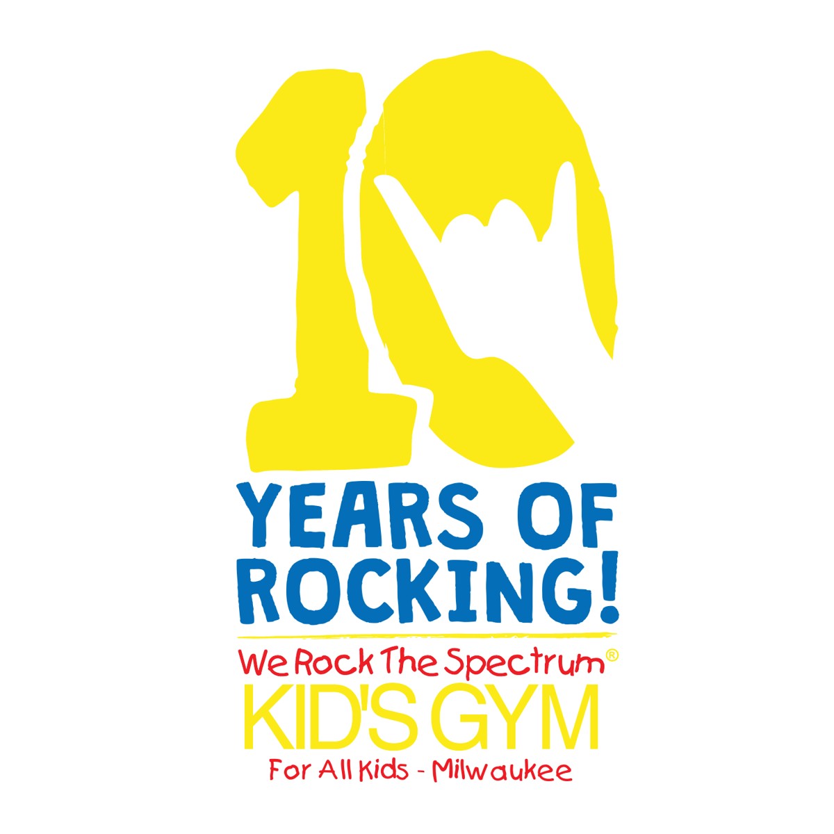
An anniversary logo for 10 years of We Rock the Spectrum Milwaukee, built from the brand’s own pieces.
We Rock the Spectrum Milwaukee was turning 10, and the anniversary needed its own mark. But the brand already has a lot going on: the red and yellow wordmark, the blue, and the We Rock boy. The challenge was celebrating the milestone without losing the look families already know.
Main goal: create an anniversary logo that celebrates 10 years and still feels like We Rock.
The rock-on hand, the colors and especially the We Rock boy are all things families already connect with. The anniversary logo didn’t need anything new. It needed to put those pieces to work in a new way.
The final logo turns the zero in “10” into a rock-on hand, so the number itself says We Rock. Underneath, a simple “Years of Rocking!” ties it back to the gym’s name and voice.
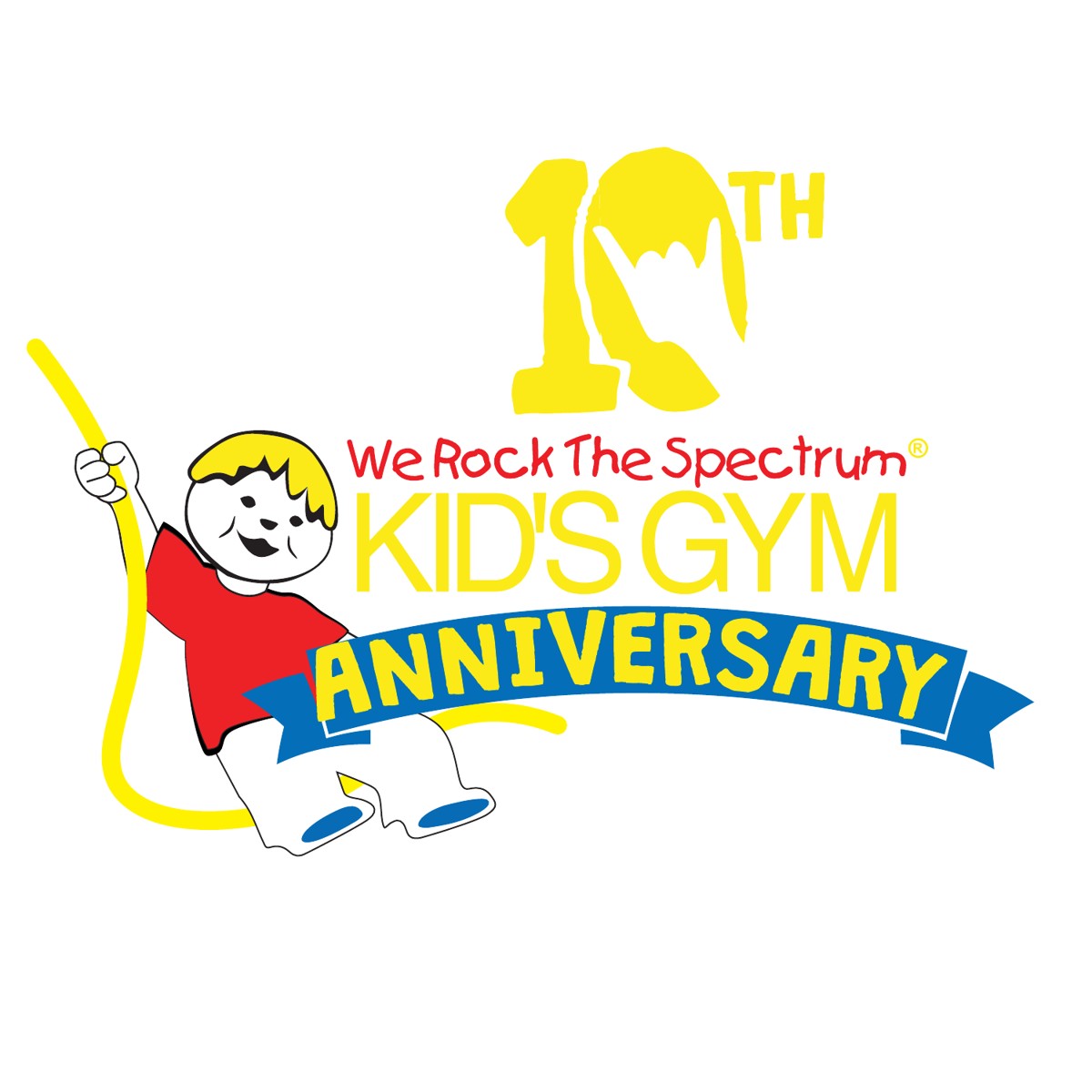
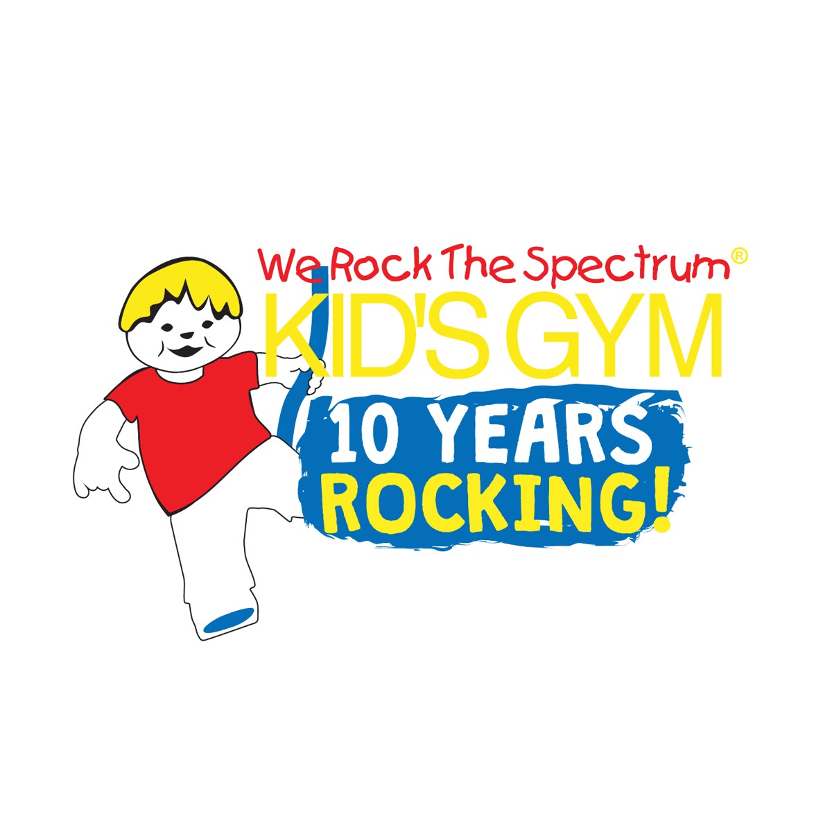
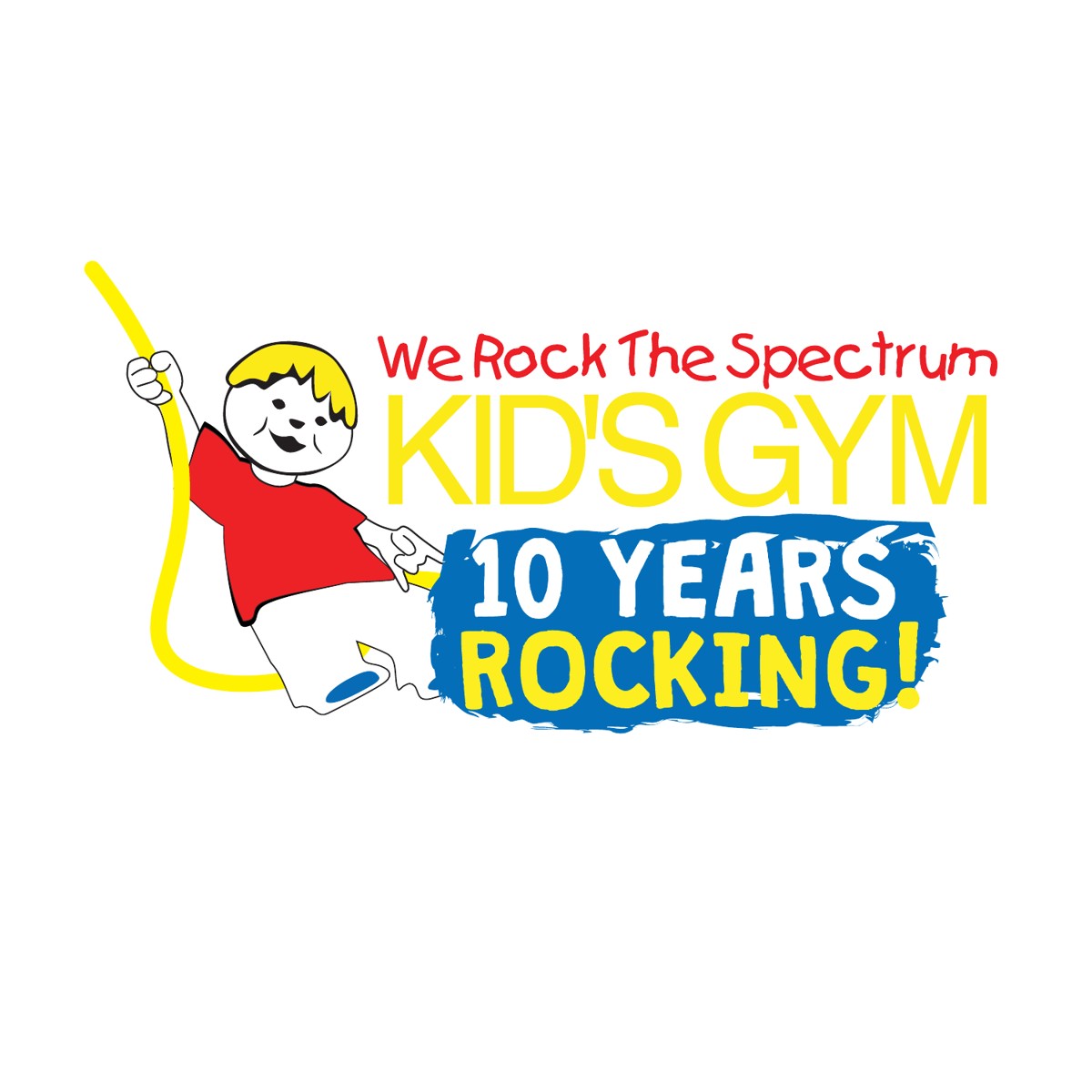
Concepts: I explored a few directions before landing on the final: a ribbon banner, a brushstroke “10 Years Rocking!” badge, and versions with the We Rock boy front and center.
The We Rock boy: he’s at the heart of the brand. He was inspired by Gabriel, the son of We Rock the Spectrum founder and CEO Dina Kimmel, and Gabriel’s autism diagnosis is what led Dina to open the first gym. So I handled him carefully. I reworked him in Illustrator, posing him to kick and to swing on a rope so he could fit each layout, while keeping his original look and spirit intact.
Final mark: a big yellow 10 with the rock-on hand, over “Years of Rocking!” and the We Rock the Spectrum Kid’s Gym wordmark.